Fonts
A font (typeface) like Arial/Helvetica, but with clearly distinguishable l, I, and 1
The Arial font (technically a typeface), and the very similar Helvetica, are commonly used in scientific documents, drawings, and graphs. Arial and Helvetica are “sans-serif”; thus, their lower-case L (l) and upper-case i (I) look almost the same. This is also true of Montserrat, the font used on this page. This is usually OK in a block of text, such as a paragraph in a paper or proposal, because one can almost always distinguish l from I in context. However, in a chemical structure drawing, or a graph, information is often conveyed by just one or two letters, such as element symbols (C, H, Cl, I) or variables/units (mL, I). For these applications, the close similarity of l and I can cause confusion.
What would a modified font look like?
Scientists tend to use standard fonts, because sometimes specific fonts are required for papers or proposals, and because the content of documents is much more important than the style. Thus, a font that easily distinguishes l and I should be a minimal modification of an existing font. In this case, something like Arial, but that clearly distinguishes l, I, and 1, could be useful.
Arial and Helvetica are commercial fonts, so distributing modified versions of them is probably not allowed. However, there are several freely editable fonts that look very similar to Arial. FreeSans is one of them.
Below is a block of text based on a recent Science abstract, and a closely related ChemDraw drawing, in 3 different fonts.
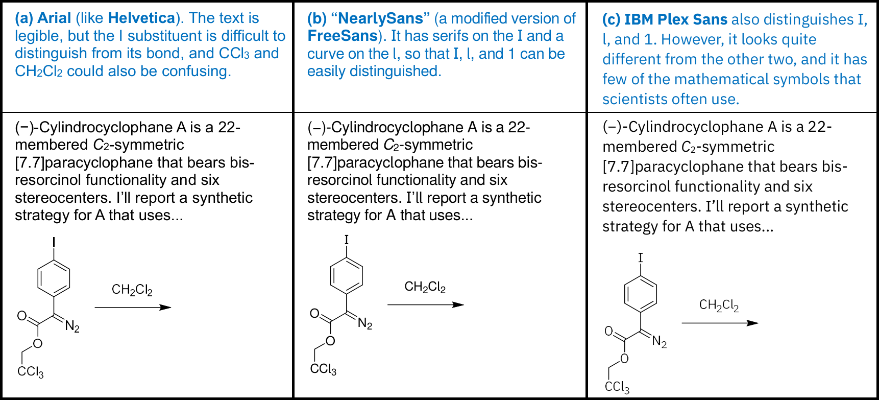
The modified typeface, “NearlySans”, is available here in 4 fonts: Regular, Bold, Oblique (italic), and Bold Oblique. Below is a link to a ZIP file containing all four, as TrueType (ttf) font files. They should be easily installable in common operating systems (Windows, macOS, Linux).
Also included in the ZIP file is a ChemDraw style sheet, ACS1996-NearlySans.cds, based on the "ACS 1996 Document" template but with the default font set to NearlySans.
Download ZIP file containing 4 modified fonts, "NearlySans"
The modified fonts, like their parents (FreeSans), are freely editable. See the license (in README.txt in the ZIP file) for details. In this version (1.1, updated April 2026), 3 new characters have been added, so that you can write high-quality chemical equations in ordinary text in any word processor, like this:
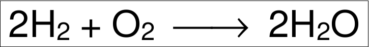
The new characters are the Horizontal Line Extension (⎯), Unicode 23AF (U+23AF); the Long Leftwards Arrow (⟵), U+27F5; and the Long Rightwards Arrow (⟶), U+27F6. The arrows are longer than the normal ones, and they match up with as many as you wish of the horizontal line extension to permit reaction arrows of adjustable length. You may also notice that arrows and other symbols look different in the Bold and Italic fonts.
Also, the shapes of rounded characters (such as c, o, Q, U) have been modified so that they match better with non-rounded ones (such as x, z, H, M). This should help the overall appearance of the font. Finally, several corrections have been made in the Cyrillic characters; thanks to Prof. Sviatoslav Baranets for pointing out errors in the previous version.
Do you have comments or suggestions? See any problems? (That could include characters that are too close together or too far apart.) Would you like to see characters in NearlySans that are not available now? Send me an email. And thanks for your interest!